


Designing for our first post-Covid in-person Sales Kickoff was a big task. Getting people together for the first time after a year or two was a bit anxiety producing as well as exciting. The look and feel of the event needed to be fun and engaging and get people excited. Employees needed to feel proud of all we had accomplished and energized for all that needed to still be done.
Our official culture mascot, “Otto” was to make an appearance and be more thought-out and advanced than ever before. Furthermore, new creative needed to stay on-brand and feel cohesive while still pushing forward. It was a fun project and something my team (Jonah Phillips and I) really sunk our teeth into. These are the results and I couldn’t be more proud.
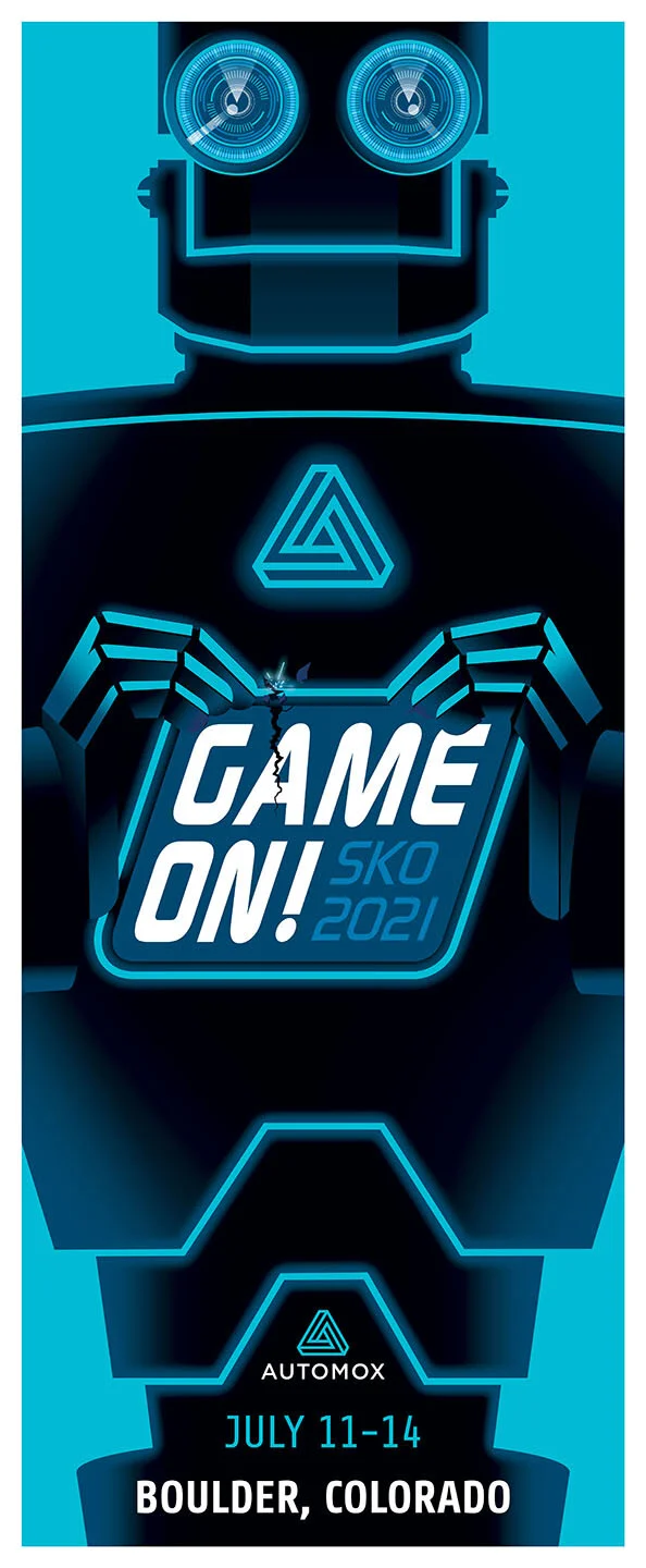
Once the theme was settled upon, “GAME ON!” - we started our mood board and visual research. We came upon this font we liked “Continuum” that had the right game feel while still marrying closely with our own corporate font “Roboto”. Marrying our brand colors and fonts created a engaging logo that helped define the rest of the project assets.
Otto had been around before I arrived at Automox and it was a cool illustration of a retro robot. That was about it. But his appeal was felt across the company. In a new pandemic world of remote workers having a cultural mascot that made everyone happy and feel connected was a big deal.
I started by simplifying and applying shapes from the logo into his body. I advanced his ocular lenses to be a bigger focus and made our voltaic blue brand color the circuitry that was crackling through his metallic body culminating in our logo as his chest energy source.
Furthermore, we wanted him interacting with the logo. Result: crushing the logo and subliminally the company crushing it’s sales goals.
In advancing the look of Otto, as always, Im influenced by my love of comics. I went back to the well again and looked at old John Buscema images of “The Vision” and “Ultron”and their first appearances in The Avengers.
I wanted Otto to be able to emote and not just be a static image. Here he is shooting lasers in either anguish or joy. The viewer decides.
Big, bold and pop. The event presentation design had to match the look and feel of the event. But also be able to stand on its own and reflect the story that was being told.
Here, our CFO, Jeff St Clair, wanted to set the tone for the kickoff and address all his new sales hirings for the first time. Many of whom are athletes and enthusiasts who love the life in Boulder Colorado.
When everyone arrived at the St Julien hotel in Boulder, they had a swag bag welcoming their arrival - name tag, stickers, shirt and hat
A simplified vector graphic of Otto that we could use for various print projects.
Simple color and brand execution and still everything pops.
This added big punch to the hotel space. As you entered the hallway to go to the auditorium, Otto was waiting for you.
In places where we didn’t have Otto the robot, we used the logo and the theme of energy circuitry running through everything. Jonah had the inspired idea to cut out the circuitry allowing the outside light to shine through. I really liked this solution
Everything being made for the event was taken from new brand web colors. Printed pieces needed CMYK equivalents and it was a big part of the project.
Getting colors that look great on the web almost never translate in CMYK. Through trial and error this is where we landed and it greatly helped us advance the brand as well.